Design notes
Reading a shirt beyond the badge
A way to look at colour, proportion and finishing details before the familiar club identity takes over.
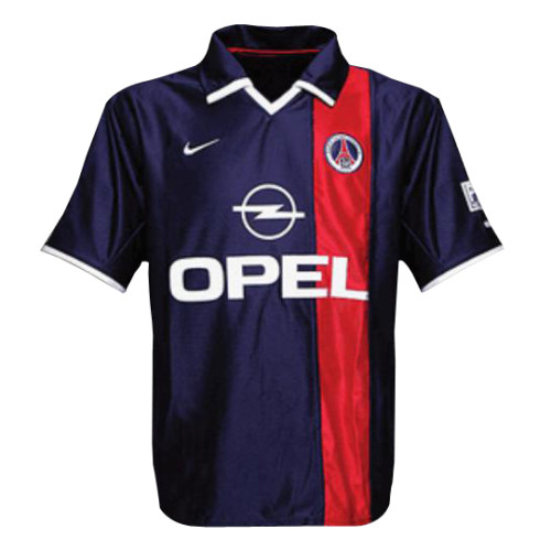
A badge is often the first thing we recognise on a football shirt. For a moment, try setting it aside. What remains is a composition: a balance of colour, a shape around the neck, a rhythm running along the sleeves.
Start with the whole shape
Look at the shirt from a distance before zooming in. Notice where the light and dark areas sit. A central stripe, contrasting sleeves or a shoulder panel can change how the same basic silhouette feels.
There is no need to rank one approach above another. The useful question is what the arrangement makes you notice first, and where your eye moves next.
Then follow a smaller detail
Move towards the collar and cuffs. Compare the width of a trim, the angle of a seam or the way a repeated colour connects two parts of the design. A detail that seems small in isolation may be doing a great deal of work in the overall composition.
The image gallery lets you move between views, where the source collection includes them. Different views can reveal different things, but photographs also have limits: lighting, framing and resolution all affect what we see.
Make the observation your own
A useful design note can be modest. It might describe how a collar changes the balance of a shirt, or why a particular sleeve detail draws your attention. Specific observations make a conversation more interesting than a verdict of simply good or bad.
Try the exercise in the retro references, then compare it with a more recent shirt study. If a detail stays with you, share what you noticed.